Making of the FOTC Hollywood Bowl Poster
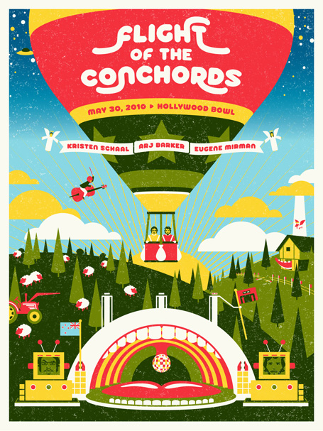
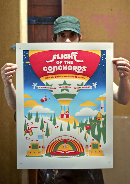
Over the past 2 years we've had the privilege of working on a few posters for the Flight of the Conchords, and recently we created a poster for their show at the Hollywood Bowl.
CONCEPT DEVELOPMENT
For this poster our initial thought was to include the Bowl itself as a central component of the design. Since the venue is so iconic, it seemed like a natural fit. We typically begin with a pencil sketch of the poster and then move on to either inked illustrations or, as was the case with this poster, straight to the computer. We wanted this poster to have a clean, geometric look, so it made sense to work directly in Illustrator.
In our previous work for the Conchords, we attempted to incorporate several themes and images from the TV series, and with this poster, because the bowl was featured, we decided to incorporate these elements into a landscape.
DESIGN AND REVISIONS
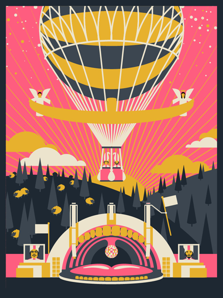
Early mockups used a darker, nighttime, color scheme, but as the poster took shape, a more cheery, fantasy world emerged that seemed to call for a bright and sunny color scheme. We also scrapped the original old-world hot air balloon for a more modern style that would provide a canvas for the show info.
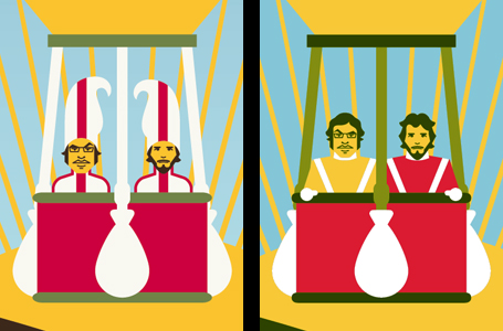

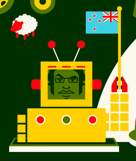
The band had a few requests including featuring Nigel, a cellist who now serves as the entire New Zealand Symphony Orchestra. We also swapped out the Femident Toothpaste costumes for Bowie's In Space pilot uniforms. In earlier versions of the poster, we began with a close to accurate rendering of the Bowl and slowly "Conchordized" it, replacing the speaker arrays with robots and the projection screens with, well, robots.
PRE-PRESS
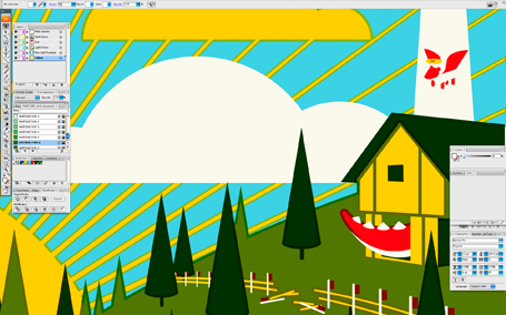
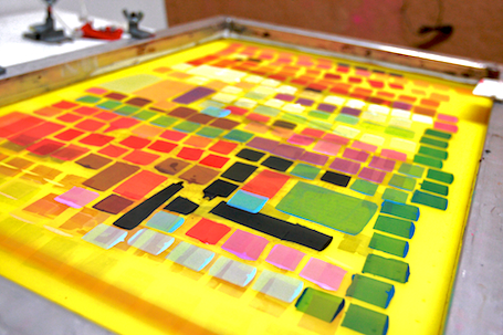
Once the final artwork was approved, we began the process of preparing the files for printing. The 5-color poster would be printed in the following order from first to last: yellow, light to dark blue split fountain, light green, red, dark green. The pre-press process mainly involved trapping, which is required to ensure that the poster registers as cleanly as possible anywhere where two color touch each other within the design. You can see an example of trapping in the image above, which shows how blue and yellow shapes overlap each other ever so slightly. By setting up the file in this way, it ensures that even if the different screens don't register perfectly, the overlapping color will compensate and avoid exposing the white of the paper below.
PRINTING
Danny Askar handled the printing for this poster and it was no small feat considering that he would be printing all 5 colors and 300 posters by hand.
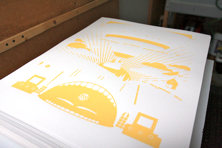
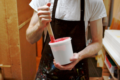
I visited Danny's studio on day two of printing to oversee the printing of the second color which was the blue split-fountain. "Split-fountain" refers to using two or more ink colors on a single screen. In this case, we were using a split-fountain to create a gradient in the sky. By nature, split fountains vary from print to print depending upon the ink placement on the screen and the blending that occurs throughout the printing process. For this reason, no two prints are alike.
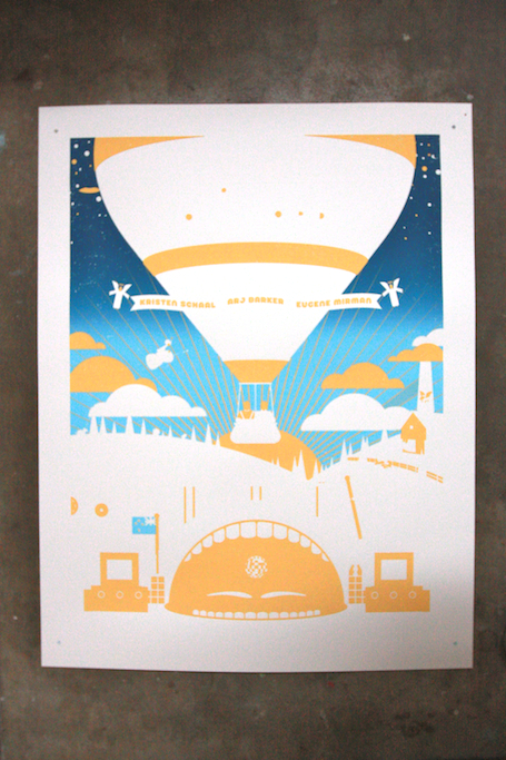
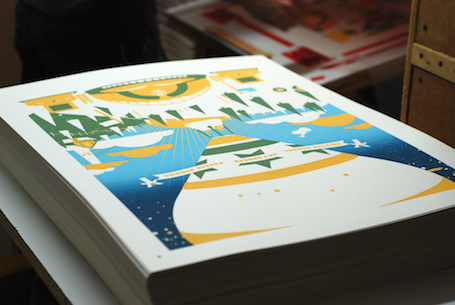
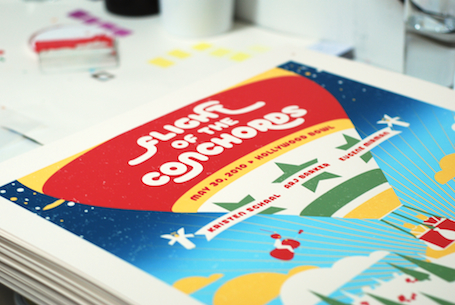
The split-fountain was followed by red, light-green, and dark-green respectively. Here are a few more photos from the printing process:
THE SHOW

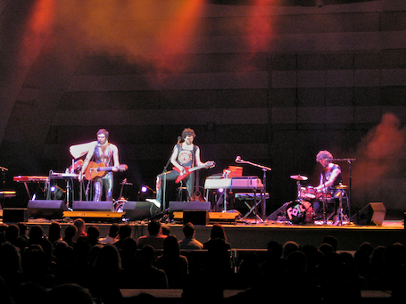
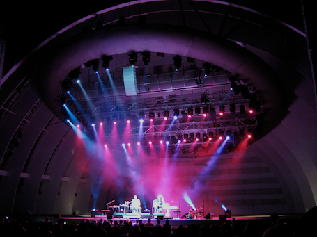
The Conchords put on an excellent show as usual, made even more special by opening stand-up sets from their fellow HBO cast members Kristen Schaal, Arj Barker, and Eugene Mirman.
Thanks to the Bret and Jemaine for including us in this show and thanks to Danny for the beautiful prints (and education along the way). Hopefully this will be the first of many "making of" blog entries and we'll attempt to highlight different parts of our process each time.
The Flight of the Conchords Hollywood Bowl Poster is available for purchase in our store.
