COME IN! A Spatial Intervention

For the past month DKNG has been preparing their very first installation piece for a show at the A+D Museum in Los Angeles. "COME IN! A Spatial Intervention" is the brainchild of local Venice artist Ashkahn. The idea behind the show was to showcase some of LA's finest up and coming artists by allowing them to use their trademark talents to fill a designated space in the museum. When we were presented with this challenge we decided to take what we know best, 2-dimensional art, and apply it in a 3-dimensional environment.
The idea was to create an entire cityscape, rolling hills and a sun and moon all on flat pieces of painted cardboard, and to hang these pieces in a way so that they were all on separate layers to create the illusion of 3D environment. DKNG primarily works within the Adobe programs Illustrator and Photoshop. The projects created in these programs use layers to keep certain sections separate from eachother for ease of editing. In conclusion, The actual installation piece created a life size environment for viewers to experience what it is like to be literally inside a DKNG project.
MOCKUPS
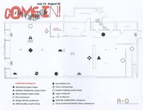
The initial floor plan with the designated areas for each artist.


Our initial mockup showing the space filled with the installation.

Once the artwork was recreated in the computer we had a better idea of the amount of cardboard needed for the project and the colors/supplies needed for the project.
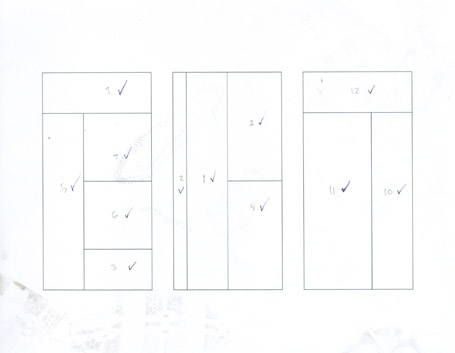

Using the computer mockup we designated 6 4"x8" sheets of cardboard to have specific cuts for each piece.
PAINTING/CUTTING/TAPING/PAINTING
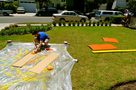
Once the initial portions were cut we began the painting process, which was to make the background for each piece.
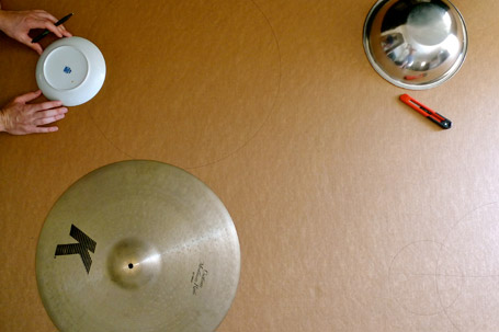
We made the round pieces (clouds and rolling hills) by using household items as stencils, such as plates and drum cymbals. Yes we play music.


The first round of painting deserved a XX break.

The next step was to cut the tops of each painted rectangular piece to create specific building shapes.
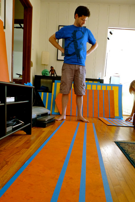
Once the pieces were cut, we began to mask off the areas for windows to be painted.

A piece with the windows painted.
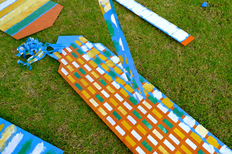

And Voila... the releasing of the masking tape.
INSTALLATION
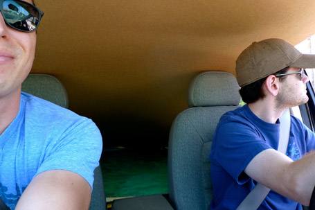
Some of the largest pieces were 8" long so in order to transfer them to the museum we had to endure a car ride with cardboard hanging over our heads.
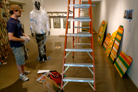
Lining up the front row of pieces for hanging.
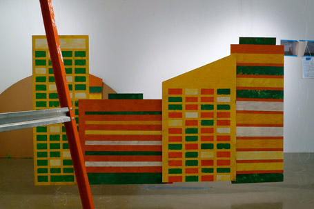
So far so good.
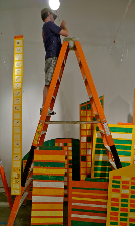
Each piece was hung by fishing line from the top of the museum's original track lighting. We added length to these tracks by zip tying long wooden dowels to each end.

I unfortunately never got any shots of the special function between the sun and moon, but if you can use your imagination, the they were hung with a pulley system against the wall so that when the sun was pulled down the moon would rise and vice versa. A young child at the show was enjoying this feature for about an hour, which was awesome to see in action.

The finished piece.

As an extra treat we taped the photos and mockups to the back of the buildings to give the viewers a more "behind the scenes" experience.
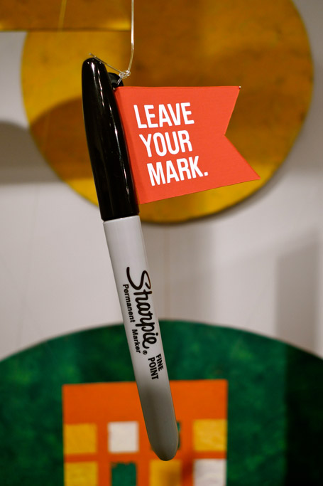
The installation was already interactive since viewers would be able to walk in between each row of buildings and hills. But we thought it would be a much more inviting piece if we hung sharpies around the installation allowing people to draw on the cardboard to add their own touch to the art.
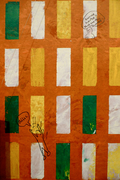

Some cool examples of viewers additions with the markers.
SHOWTIME
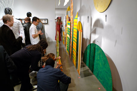

All in all the show was a great success. There was an overwhelming turnout and we received and equally overwhelming response for our work. Thank you to everyone that showed their love and support. Without it, we would not be where we are today.